Within the first second or so, and before the reader has read any text or started to consciously think about what they’re seeing, they’ll probably grasp the following basic information in roughly the following order:
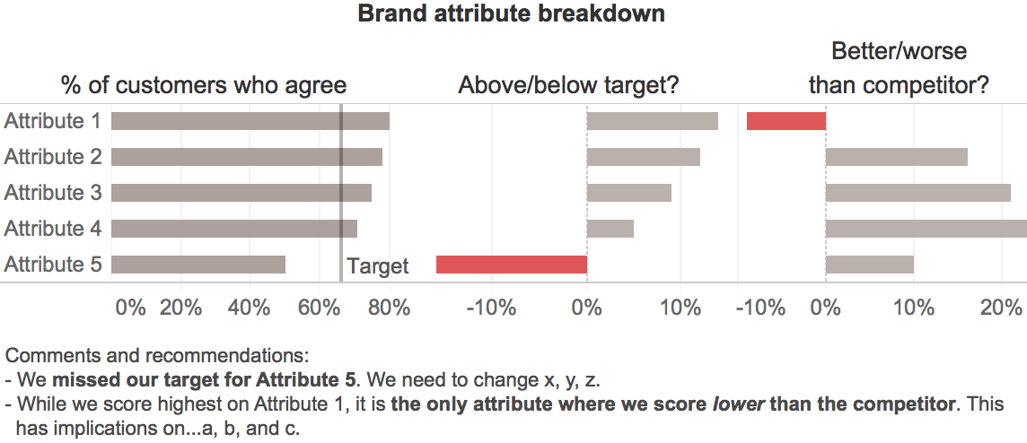
- There are two problems, i.e., the two red objects. It's good that these are the most noticeable elements in the graph since they're our main message.
- Those two problems are problems because they extend to the left (i.e., are negative) while all of the other values in their respective groups extend to the right (i.e., are positive), which is an important element of the main message.
- The data consists five items (the rows), each of which has three values associated with it (the columns), i.e., the basic structure is immediately obvious.
- The items are sorted from largest to smallest, based on whatever variable is represented in the left-hand column of bars.
As the viewer starts to read the text labels, the additional understanding that those labels provide (i.e., that the data are measures of how customers feel about our company's attributes, that those measures are being compared with internal targets and responses to a competitor, etc.) falls nicely into the basic --but accurate-- framework of understanding that’s been set up by the graphical elements. This, in turn, enables what I’m guessing would be rapid and cognitively easy visual consumption and quick understanding of the key messages, though only a well-designed user test would be able to determine this with confidence.
As with almost any design, there are, of course, trade-offs. In this case, the main one is that the actual “% of customers agree” values for the competitor aren’t shown, only the differences between those values and those for our company. That was a judgment call that I made based on the assumption that the audience would care more about the differences between our company and our competitor as opposed to the actual values for the competitor, but that assumption may not be valid.
What do you think? Can you see any other problems with this redesign or can you think of a better one? If so, please pipe up in the comments.