
As I’ve discussed in a previous blog post, a dashboard that doesn’t visually flag metrics that require attention will likely flop with users. Indeed, the fact that the majority of dashboards lack such indicators could be the number one reason why so many of them fail to deliver the user satisfaction and traction that was hoped for.
While most dashboards lack alert indicators of any kind, some dashboards do have them. Among dashboards that actually have them, the most common types of alert indicators are “% change vs. previous period”, “% deviation from target”, and “good/satisfactory/poor ranges”. If you click on any of those links, though, you’ll see examples that illustrate why these methods are all surprisingly bad. They visually flag all values all the time (the dreaded “Christmas Tree Syndrome”), and routinely flag values as “good” that are actually in crisis or fail to flag genuine crises.
Although it’s a less common way of flagging values that require attention, participants in my Practical Dashboards workshops often ask about “% deviation from trailing average”, so I’ve written this post to illustrate why that method actually isn’t much better than the others.
On a dashboard that uses “% deviation from trailing average” indicators, the dashboard calculates each metric’s average value for, say, the last 30 days, and then shows the deviation of the most recent day’s value from that average as a percentage, something like this:

The idea, of course, is that a metric that’s currently deviating a lot from its trailing average requires more attention, which makes sense. In theory. Let’s have a look at it in practice, though.
The first problem with this method is that almost all metric values deviate at least a little from their trailing average almost all the time, which means that pretty much all values on the dashboard get flagged all the time (a.k.a. “Christmas Tree Syndrome”):
So, which values actually require attention on this day? All of them? Probably not. None of them? Maybe. Are we having a good day or a bad day? Or a completely normal day? Hmmm.
Basically, flagging everything is the same as flagging nothing. It doesn’t help users spot values that genuinely require attention, or even figure out if anything requires attention at all. Right away, this should largely disqualify “% deviation from trailing average” as a useful way to visually flag metrics on a dashboard, but the problems actually don’t end there. Let’s have a closer look at some individual metrics:

If “Employee Satisfaction” is 5.2 on 10, that’s a crisis, but because it’s been a crisis for the last 30 days, the “% deviation from trailing average” is positive on this particular day so the dashboard flagged it as “good” (i.e., green). No one in the organization thinks that an “Employee Satisfaction” score of 5.2 on 10 is “good”, though, so this alert indicator is wrong, and this type of "wrong alert" error occurs all the time.
What about these two measures?
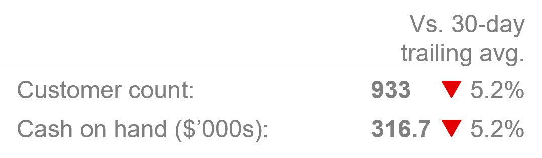
Both of these values are indeed problems, so at least the alert colors are correct in this case. The thing is that the “Customer count” value is a huge problem, but the “Cash on hand” value is actually not much of a concern. “Cash on hand” bounces around all the time, so being 5.2% off its trailing average is no big deal. The problem, of course, is that the alerts for these two metrics look the same because they happened to deviate from their trailing averages by the same percentage on this day.
If a large % deviation from the trailing average may or may not indicate a genuine problem, and a small deviation may or may not indicate a genuine a problem, users must slowly, manually consider each value on the dashboard, one a time, to figure what actually requires attention or not. Since the dashboard in this example is a daily dashboard, users have to do that for every single metric, every single day. In other words, they’re not going to do that, and they’ll quickly start ignoring the alert indicators because they’re not actually helping them to spot problems, and users may end up abandoning the dashboard altogether because it’s just too time-consuming to review.
For these and other reasons, I don’t think that “% deviation from trailing average” is useful on dashboards. Is there a better way? Yes, for the last several years, I’ve been using what I call the “four-threshold method” for flagging values on a dashboard. It doesn’t have any of the shortcomings listed above and you are, of course, welcome to use it, as many other dashboard creators have started doing after realizing how unhelpful conventional alerting methods are to their users.