
When I show line charts like this in my Practical Charts workshops…
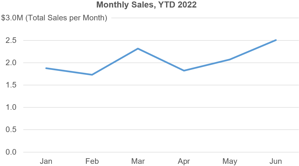
…participants sometimes object, saying something like, “Isn’t this chart technically misleading? It looks like, for example, Sales increased at a perfectly steady rate between the middle of February and the middle of March, but they almost certainly didn’t. Sales typically bounce around from day to day, but this chart makes it look like they always increased or decreased at a perfectly steady rate in between the midpoint of each month.”
If I switch to showing a chart of daily Sales instead of monthly, they seem to be more satisfied:

“See?”, they might say, “That’s what Sales really looked like.”
Thing is, I don’t think that that’s what Sales “really” looked like, either. This daily chart makes it look like Sales increased or decreased at a perfectly steady rate between the midpoint of each day, but they almost certainly didn’t. Sales almost certainly bounced around in between the midpoint of each day (assuming that we had multiple Sales transactions per day). In fact, even if we were to show hourly Sales, we’d still be “misrepresenting the data”, according to this reasoning.
The mind-bender here is that “Sales” is actually a series of values (individual Sales transactions) that occur at single points in time of zero duration, i.e., the instant that a client finishes signing a contract, the instant that a payment is processed, etc. Technically, then, the only way to visualize Sales without “misrepresenting the data” would be something like this:

While very detailed, a chart like this isn’t particularly useful in most situations since it’s very hard to see if Sales are increasing or decreasing over time, which is probably why we virtually never see measures like Sales visualized like this. For these kinds of measures, it’s almost always more useful to visualize how daily/weekly/monthly/etc. totals (or means, medians, etc.) change over time.
The daily and monthly charts above aren’t charts of Sales, then, they’re charts of the trend of daily or monthly Sales totals, which isn’t the same thing as “the trend of Sales”.
In the monthly Sales chart, for example, time is divided into intervals of months and each month has exactly one value that represents the entire month, i.e., the total of all Sales transactions that occurred during that month. Technically, that value isn’t “Sales for that month” since, as we just saw, that would be a series of individual values (Sales transactions) that occurred at single points in time during the month. Instead, that value is the total of all Sales transactions for that month; it’s a single number that summarizes all the individual transactions that occurred during the entire month.
When someone says that they’re concerned that, in a monthly chart, the “intermediate values that occurred in between the points are hidden”, that doesn’t really make sense when you think about it. There are no “intermediate values” that occur in between monthly Sales totals since those would be “intermediate monthly Sales totals”, which doesn’t make sense: There’s only one monthly Sales total per month.
When I point this out, workshop participants sometimes then suggest that, according to this reasoning, we should really show monthly Sales totals as a step chart like the one below, since each value represents an entire month:

I do think that step charts have their use cases, but this isn’t one of them. This step chart makes it look like each monthly Sales total “began” at the beginning of the month and then “ended” at the end of the month. That’s not what happened, though. At the beginning of each month, we didn’t even know what the total would be for that month. At the end of the month, we calculated a single value (the monthly total) that summarized the month. The monthly total isn’t a value that “occurred throughout the month”, it’s a single value that summarizes the entire month, which isn’t the same thing.
When we connect these summary values with lines in a “standard” line chart, we get a chart that shows the trend of monthly Sales totals. We don’t see “the trend of Sales”, but that’s OK because that’s not what this chart purports to show (and, as discussed earlier, it would be hard to visualize “the trend of Sales” without summarizing them in some way).
If you’re concerned that the monthly view doesn’t show, for example, the fact that Sales were much higher in early March than in late March, this simply means that you’re trying to communicate an insight that would be best illustrated by a chart of daily Sales totals, not monthly ones. If you need to communicate an insight about longer-term patterns, though, such as comparing the pattern of Sales for this year to the same period last year, then the monthly view would be a better choice. If you need to communicate both types of insights, you could just show both views (making sure that the time scales of both charts line up nicely):

Is the daily chart a “more accurate representation” of Sales than the monthly one? I don’t think so. The daily chart is just a better choice if you’re communicating shorter-term or more granular types of insights, and the monthly one is better if you’re communicating insights regarding broader, longer-term trends.
What does all this mean when it comes to designing charts?
When we’re showing summary values (totals, means, medians, etc.) for regular intervals (days, weeks, months, etc.), I don’t think that connecting these values in a line chart “misrepresents the data”; it’s a perfectly accurate representation of the pattern of change of those summary values. The innumerable chart creators who create charts like this every day can, IMHO, continue to do so without worrying about “misrepresenting the data”.
Agree? Disagree? Let me know on LinkedIn or Twitter!
By the way...
If you’re interested in attending my Practical Charts or Practical Dashboards course, here’s a list of my upcoming open-registration workshops.