
Say you work for a charity, and you need to show donations by region, but one of the regions has way, way more donations than the others:

This chart is fine if you just need to show that the East region is far greater than the others, but let’s assume instead that you need to say something about how the small regions compare with one another:

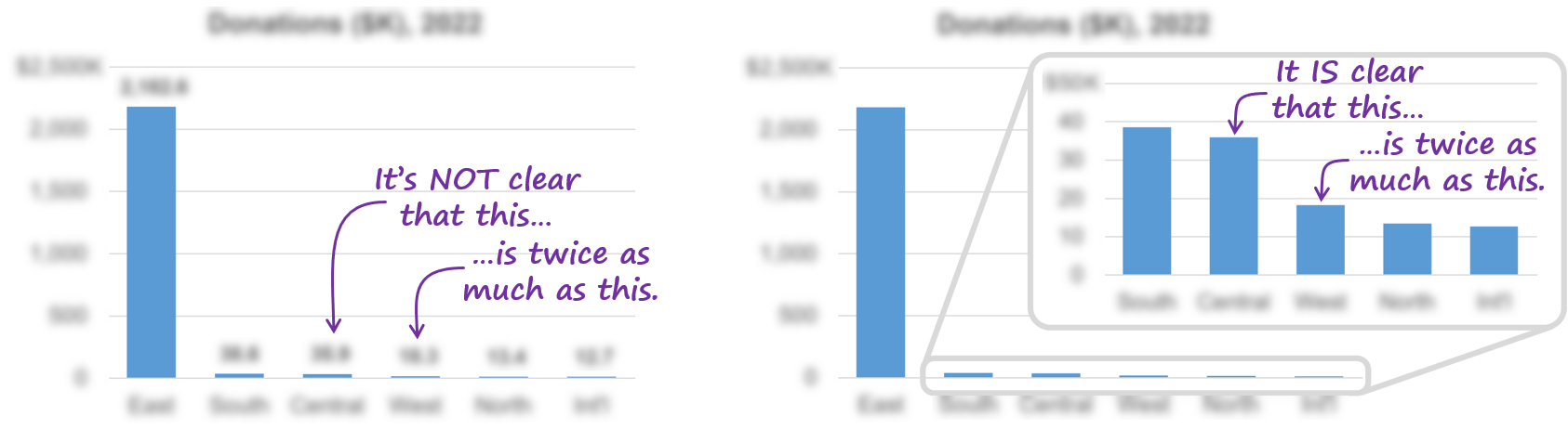
The bars for the smaller regions are too small to compare, so, clearly, this chart design doesn’t communicate this particular insight effectively.
“I know,” you think to yourself, “I’ll just label all the values directly in the chart. That way, the reader can just read the numbers and compare the smaller values with one another.”

Yes, the reader can now compare those small values, but chart itself is more cognitively cumbersome because interpreting textual value labels requires several cognitive steps:
Decode the squiggly symbols above each bar (i.e., the numbers that took years of primary schooling to learn how to read and understand)
Convert those squiggly symbols into mental representations of quantities
Do mental math on those squiggly symbols to compare them
Because the graphics (the bars, in this case) aren’t communicating what the reader needs to know about this data in this situation, the reader must rely almost entirely on reading the value labels. In that sense, a chart like the one above is almost the same as showing the data as a table of numbers, since the graphics in the chart aren’t doing much to communicate the specific insights that the reader needs in this situation.
Yes, the cognitive steps required to read numbers in charts, convert them into mental representations of quantities and do math on them can be done and don’t take long, but they definitely require more cognitive work than charts in which the graphics do most of the communicating. Researchers have known for decades that people can read and understand quantitative data far more quickly and easily as graphics than as textual numbers, but you can see this for yourself if the chart above is redesigned so that the insight in question is communicated primarily by the graphics rather than textual value labels:

In this version of the chart, the reader can see that the “Central” value is about twice as much as the “West” value almost instantly, no squiggle-converting or mental math required.
So, what does this mean when it comes designing charts in practice? Well, if a chart that you’re creating relies mostly or entirely on reading textual value labels in order communicate the insights it needs to communicate and the graphics aren’t contributing much, that’s a big hint that the chart should probably be redesigned.
How can you know if your chart relies mostly or entirely on reading textual labels? Well, you could try the “squint test”. This involves squinting your eyes so that your vision is blurred just enough that you can’t read any of the text, but you can still see the graphics. Then, see how much of the information that you want readers to get from the chart is still clear:
How do you design graphs that communicate key information graphically and that don’t rely heavily on textual value labels? For example, how did I think of using an “inset chart” to improve the chart above? Well, there are far too many ways to make charts “graphically obvious” to cover in a blog post, but I do cover them in my Practical Charts course :-)
By the way...
If you’re interested in attending my Practical Charts or Practical Dashboards course, here’s a list of my upcoming open-registration workshops.