
Imagine you’re a data analyst for an electronics retailer and the management team has asked you for a chart of the price history of one of the TVs that you carry. Since the data consists of values over time, you decide to show it as a standard line chart:

Hmmm. Some things about this chart don’t look quite right, do they? For example, it looks like the TV had a price at the beginning of April ($400) and then nothing until the end of April, when the price was $350. That’s not what happened, though. This TV did have a price between the beginning of April and the end of April: It was $400. Indeed, it had a price continuously throughout the entire period shown, but that’s not what this standard line chart suggests.
There’s another, more insidious problem with this chart: I’ve seen readers with less chart-reading experience interpret a chart like this to mean that, for example, the price of the TV steadily declined from $400 at the beginning of April to $350 at the end of April. That, for example, the price in mid-April was around $375. But it wasn’t; it was $400 that whole time.
That’s why I consider that showing data like this as a standard line chart is a data visualization mistake, i.e., a design choice that poses a high risk of misrepresenting the data.
What’s going on? What is it about this particular data that makes showing it as a standard line chart so problematic? Two things:
The values in this data occur at irregular intervals of time. For example, the price of the TV can change five times in one day and then stay the same for three weeks. Standard line charts, however, only work well when the values occur at regular intervals of time (one value per day, one value per month, etc.).
The values in this data are persistent. For each value (i.e., each new price of the TV), that value remains in effect until the next value occurs. For example, when the price of the TV changes from $400 to $350, the new price of $350 remains in effect until the next price change occurs. Because each value “persists” until the next value, I call time series values like these “persistent.” They’re quite different from “non-persistent” values like, for example, “daily sales totals,” because, if a daily sales total for one day is $104,762, that value doesn’t “persist” into the following day if there’s no value for the following day. As you can see in the chart above, standard line charts don’t work well when the values are persistent.
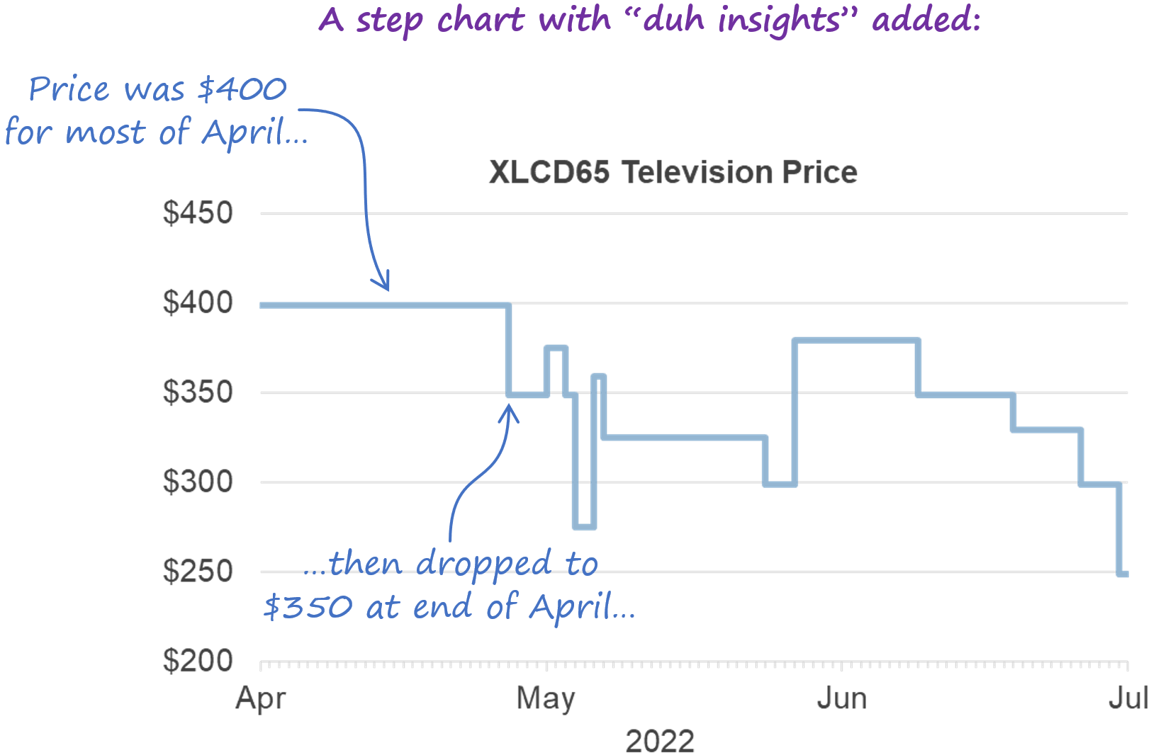
Is there a way to show this kind of irregular, persistent time series data accurately? Yes, you could use a step chart (a.k.a., a stepped line chart):

Sure, this is a less common chart type, and it might be unfamiliar to your audience, but at least it shows irregular, persistent time series values correctly, which a standard line chart does not.
What if you need to show some time series data that consists of irregular, persistent values, but you know that the audience is unfamiliar with step charts? Well, if you’re able to “narrate” the chart for them (“During most of April, the price was $400, then, at the end of April, it dropped to $350…”), they’ll probably grasp it quickly. If you’re not able to narrate the chart, you could include what I call “duh insights,” which are insights that would be very obvious to anyone who already knows how to read that chart type (hence the “duh”), but very helpful to those who are unfamiliar with it:
Now that you know how to recognize irregular, persistent time series values, you’ll probably come across them fairly often. For example, all of these are irregular, persistent time series:
The inventory level of a product
The current highest bid on an auction item
A bank’s prime lending rate
A bank account balance
So, if you haven’t been using step charts, there’s a good chance that you’ve been misrepresenting at least some of your data to your audience. That’s why I suggest that, if you can, try to start using step charts whenever you need to show irregular, persistent time series values, and start getting your audiences used to seeing this chart type. If you’re not sure how to create a step chart in your dataviz software of choice, just Google “how to make a stepped line chart in [name of dataviz software you’re using]” and you’ll get plenty of decent tutorials and videos.
By the way…
This article is based on a section from my Practical Charts book. Visit the official book page to learn more about the book and for purchasing information.