
You’ve probably seen “smoothed” or “curvy” line charts like this before:

If you do a bit of research about this chart type, you’ll find that some people like them and others definitely don’t. Among those who say that smoothed lines should be avoided, the main concern seems to be the “overshooting” problem, whereby the line can end up going outside of the actual range of the data:

I’ve also come across a few other concerns regarding smoothed lines, such as the risk that they might imply that there are “intermediate” values in between the actual values in the chart when there aren’t any, or that they imply that the data is sampled from a continuous process like the temperature of a lake, even if it’s not. Personally, I don’t think that most audiences will perceive smoothed lines in those ways—especially if the values are indicated with small markers on the line—but I’m not aware of any studies that support these opinions one way or the other.
Another concern with smoothed lines is that the chart creator must choose the degree of smoothing to apply, i.e., whether to make the line segments curvier or straighter. This is a subjective choice and the degree of smoothing that the chart creator chooses could, theoretically, alter how readers perceive the underlying data.
Why would a chart creator decide to smooth the lines in a chart, then? In all the examples that I’ve seen, it seems that it was a purely cosmetic decision, i.e., the chart creator just thought that smoothed lines looked nicer.
Should you avoid using smoothed lines, then? Well, if your chart is intended to entertain or inspire readers and potential, small misrepresentations of the data don’t matter much, smoothed lines are probably fine:

(BTW, this chart is from Tyler Vigan’s “Spurious Correlations” site, which is hilarious. Visit it immediately).
If, however, your chart is going to be used in a business or technical setting in which communicating information quickly and clearly is a high priority, I’d avoid them. Even though I don’t think that the risks of smoothed lines are as significant as some people make them out to be, I’m not aware of any actual benefits of using them aside from purely cosmetic ones. (And, are smoothed line segments really that much prettier than straight ones?)
As with any good guideline, there are exceptions (two, in this case):
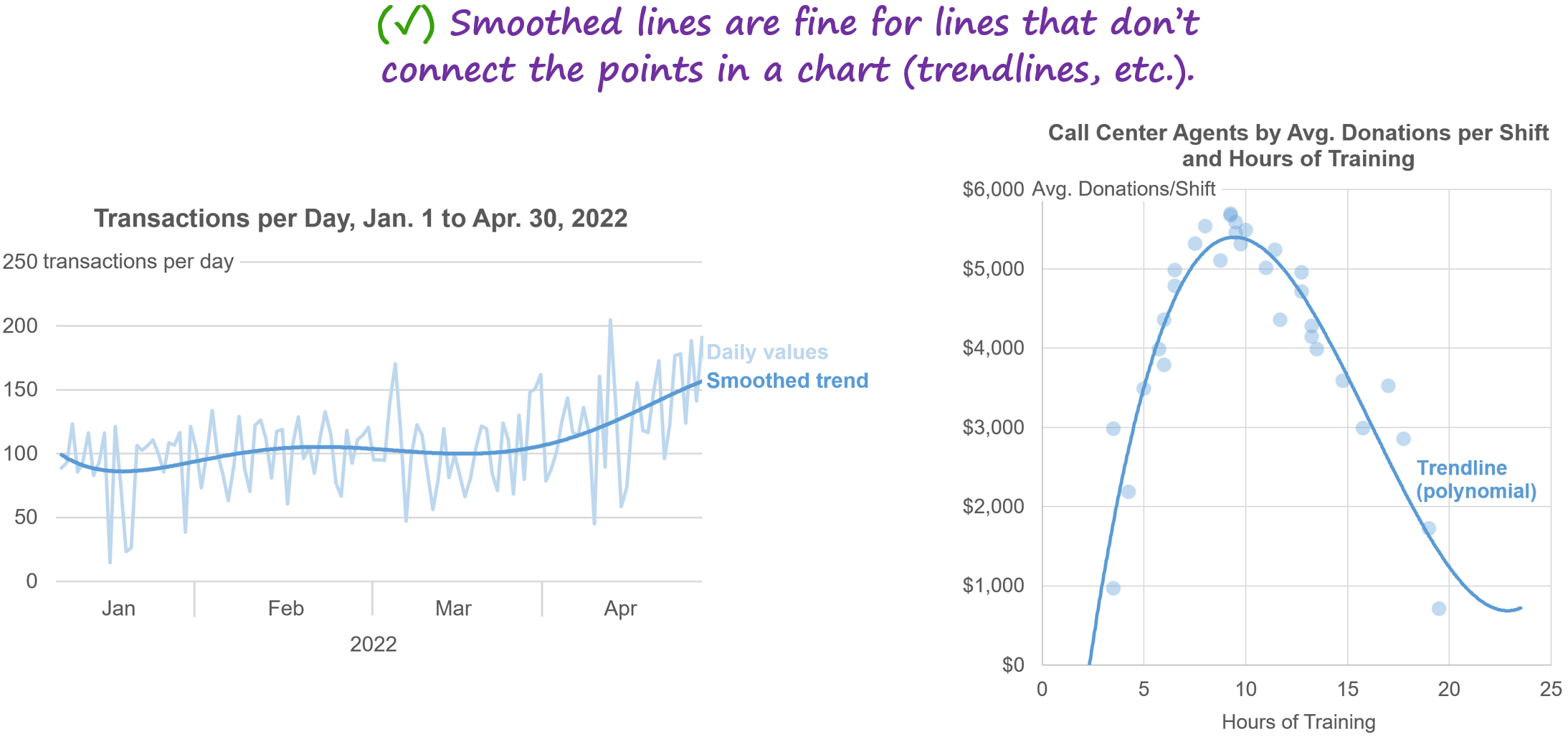
1. Smoothed lines are fine for lines that don’t directly connect the points in a chart, such as trendlines, because the risks that I just mentioned aren’t risks for these types of lines:
2. Smoothed lines are fine in bumps charts because the risks that I mentioned don’t really apply when showing changes in rank, and a different smoothing algorithm can be used that forces the lines to be perfectly horizontal when they pass through each point, which eliminates the “overshooting” problem:

[Feb. 14, 2024, 2pm ET update: Shortly after this article was published, smart cookies Daniel Zvinca and Kerry Kolosko pointed out that the overshooting problem can be solved by using a type of smoothing algorithm called a "monotone" algorithm, similar to what's used in the bumps chart above. This is absolutely true, but this type of smoothing sacrifices much of the aesthetic appeal of smoothed line charts (to my eye, anyway), especially when the values don't occur at regular intervals:

Personally, I don't think this is a great solution, then. While it does solve the overshooting problem, it also negates the main advantage of smoothed line charts (i.e., aesthetic appeal), although I recognize that this is subjective.]
What do you think? Are there any benefits or downsides of smoothed lines that I didn’t mention? Let me know on LinkedIn or Twitter!
BTW…
If you’re interested in attending my Practical Charts or Practical Dashboards course, here’s a list of my upcoming open-registration workshops.