
Trigger warning: This post isn’t (directly) dataviz-related.
Not to flex or anything, but I’m somewhat of a connoisseur of hotel shower faucets. I travel frequently to deliver workshops, so I’ve seen many different models. A lot of them look almost like modern art sculptures. Clean lines. Pleasing symmetry. Modern aesthetics.
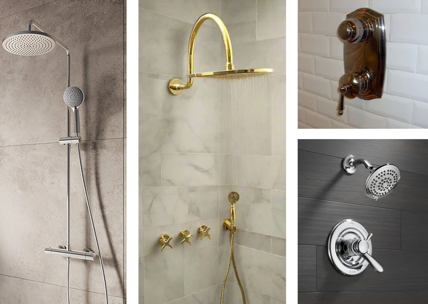
But how do I, y’know, have a %#*$ing shower? Which knob controls the flow rate? Which knob (or knobs) control the temperature? Do I tilt the knobs up and down, or rotate them? Or push/pull them? If I rotate a knob, say, 45 degrees, will that make the water a little hotter, or a lot hotter? How do I redirect water to the shower head, hand-held hose, or tub spout?
First-world problems, I know, but if I’m coming off a transatlantic redeye, my desire to conduct trial-and-error experiments to answer these questions is precisely 0.000. Why do so many faucets force me to do just that, then?
Well, I think these are classic examples of prioritizing aesthetics over usefulness. When these faucets were designed, the number one priority was to design a “beautiful object,” rather than a useful one. Something that would impress the head of the design team or look great in a plumbing supply showroom, but that no one actually tried to use before installing 1,000 of them in a hotel. You can see evidence of these priorities in some faucet models in particular, which have “H’s” and “C’s” on them, but in lettering that’s so small or etched so faintly that most people won’t even notice it. Why not add more noticeable, helpful icons? Because that would ruin the aesthetics.
If, however, a hotel chain were to install faucets like the one in the 3D rendering below (created by my talented daughter, Jennifer, in Blender), I might just become monogamous with that hotel chain:
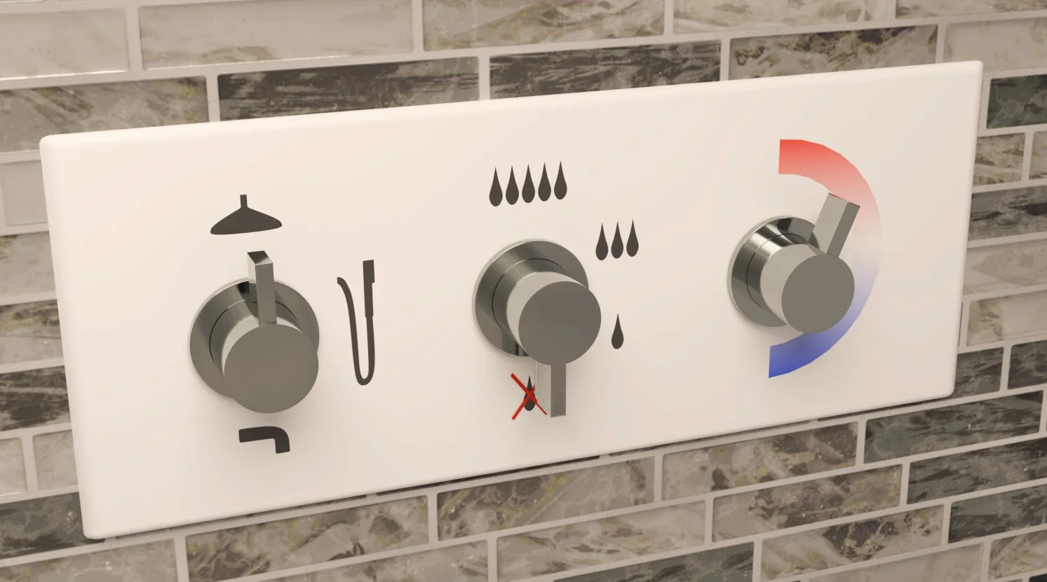
Is this a beautiful object? No. Is it at all distinctive or creative? Definitely not. Can I have a shower without reverse-engineering the plumbing first? SOLD.
I love beautiful objects, but they don’t belong everywhere. If they get in the way of performing mundane tasks like having a shower, then they’re in the wrong place, IMHO. In the context of a hotel shower, the value of a beautiful object is lower than the value of being able to figure out how to have a shower in 1 second, instead of 30 or 40.
Now, even though this fictional faucet is simple-looking, I did have to put some thought into it to make it immediately grokkable:
The shape of the knobs makes it clear that you rotate them (you don’t tilt them or push/pull them), and the rectangular paddle in each knob doubles as a pointer that makes it clear what each knob is “doing” at the moment.
The available range of motion of each knob is clear (all knobs rotate within a 180° range to the right).
Having one knob per function makes it easier to do what you want (change the water outlet, change the flow rate, etc.), rather than having just one or two knobs that combine multiple functions.
The sequence of the knobs reflects how people start having a shower: select the desired outlet, then turn on the water, then adjust the temperature.
The icons are recognizable by people from different parts of the world (kind of important in a hotel) and are large and high-contrast enough to be easily seen by people who aren’t wearing their glasses (because, y’know, people generally don’t wear their glasses in the shower).
Because of these design choices, a faucet like this would almost certainly reduce the incidence of water shooting out of unexpected places at unexpected temperatures (a surefire way to tank guest satisfaction) and, more importantly, would probably be easier to use for those with mild visual, motor, or cognitive impairments.
Yes, the modern-art faucets might look simpler at first glance because they don’t have lots of icons on them, but the thing is, those icons contain information users need in order to use the faucet. If that information isn’t there, users are forced to deduce that information for themselves, which actually makes it more complicated. Prominent, explicit icons might not look as “clean,” but they remove annoying guesswork.
While I warned you that this article didn’t have anything to do with dataviz, there actually might be a few analogies with chart-making, here:
Beautiful charts have their place, but it’s probably not in “mundane” contexts like business reports and presentations, where more useful but less beautiful charts may be more appreciated by users.
Sometimes, adding information to a chart makes it simpler, especially when users would have to deduce that information on their own if it wasn’t in the chart.
Making a chart look simple and obvious actually requires quite a bit of thought and a surprisingly high degree of skill.
Speaking of skills, registration is now open for my February live online workshop! Interested in taking my Practical Charts and/or Practical Dashboards course? Early-bird prices end Jan. 15. Course info and registration page: https://www.practicalreporting.com/feb-2025-workshop