

tl;dr: I don't use radar graphs because more informative and familiar chart types such as heatmaps and overlapping cycles charts can always communicate the same insights. Also, I'll be delivering a live, in-person workshop in Amsterdam in October, and will provide the registration link at the end of the article.
In my Practical Charts course, there are about a dozen chart types that I recommend avoiding in “everyday” business reports and presentations, including box plots, bullet graphs, connected scatter plots and, yes, radar graphs. These are also known as “spiderweb graphs” and a few other names, but I’m going to call them “radar graphs” in this article.
If you’re not sure what a radar graph is or how to read one, great! Stop reading now. 😂
If, for some reason, you want to invest your time into learning how to read a chart type that I don’t think you should ever use, this is the best explanatory video I could find.
Now, to be clear, I don’t think radar graphs are “bad” or “useless.” You can get useful insights from radar graphs. What I am suggesting is that any insight that can be spotted in a radar graph is at least as clear in more informative and familiar chart types, so there are no situations in which radar graphs are the best choice. Jump in in the comments to prove me wrong, though. 😁
Before looking at some examples, I need to point out that there are two common—but very different—ways in which I see radar graphs being used in the wild:
Comparing several items (e.g., cars models) based on several attributes (e.g., price, fuel economy, safety ratings, etc.), which is the most common use of radar graphs.
Showing cyclical time series data, that is, data with repeating weekly/monthly/yearly/etc. cycles (e.g., hourly electricity consumption, monthly suntan lotion sales).
I need to mention this because the alternative chart types that I use instead of radar graphs are different for each of these two situations.
Let’s start with…
Radar graphs for comparing several items based on several attributes
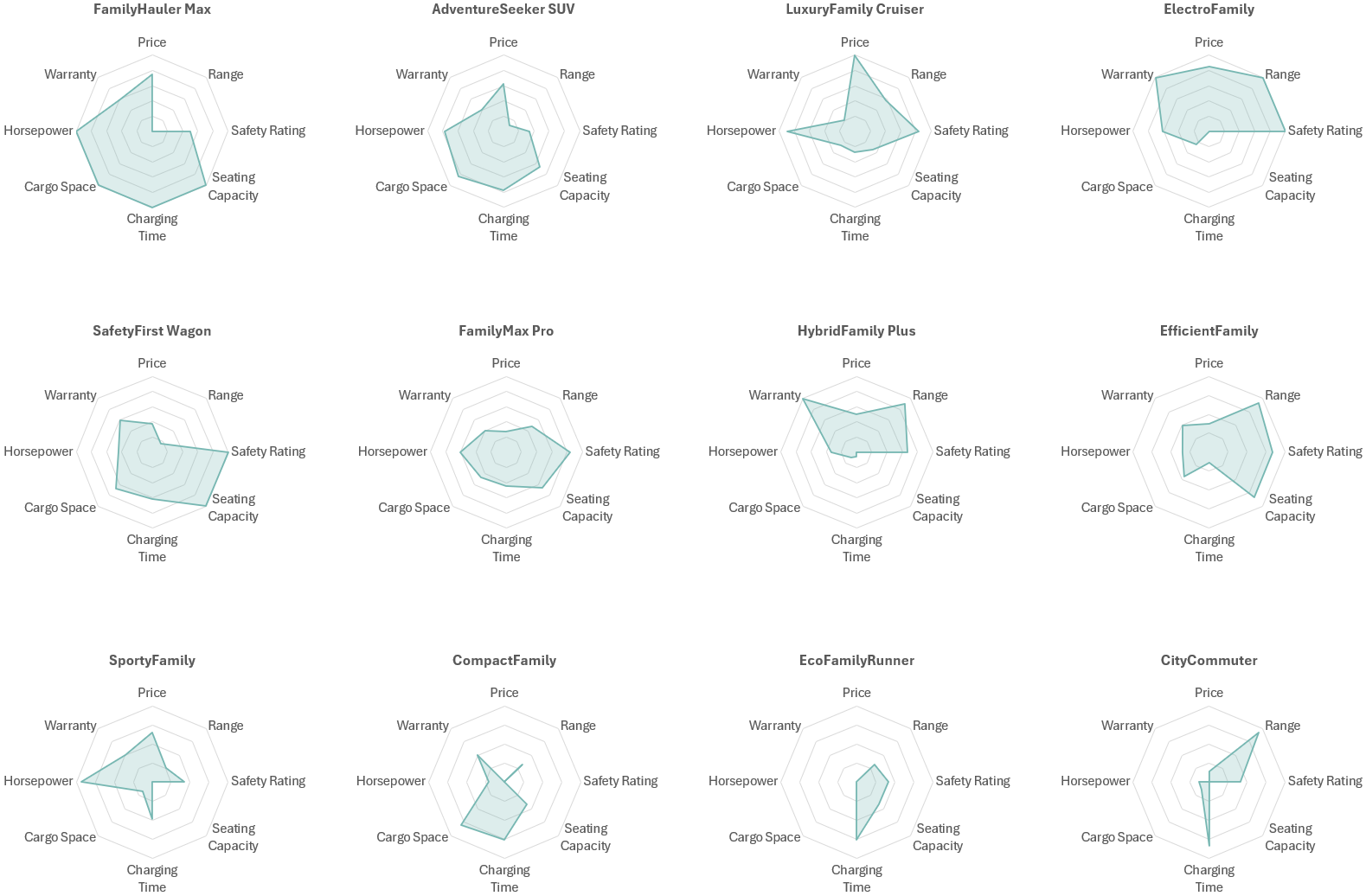
…like this one, which is designed to compare four car models based on eight attributes:

If you know how to read a radar graph and stare at this one long enough, you might notice insights such as:
The ElectroFamily model scores better than the others for Warranty, Range, and Safety Rating, but poorly on other attributes.
The FamilyHauler Max has many desirable attributes, including Horsepower, Cargo Space and Charging Time.
The Adventure Seeker has generally lower scores that the other models.
For giggles, let’s look at the same data as a…
Heatmap

To my eye, anyway, all the insights that I identified in the radar graph aren't merely as clear in the heatmap, they’re considerably clearer. As a bonus, there's a much greater chance that the audience already knows how to read a heatmap like this than a radar graph.
Another concern with radar graphs is that they become essentially unintelligible when comparing more than four or five items:

A messy radar graph like this can be split into a "small multiples" arrangement, but now comparing items with one another is considerably more difficult because the items are no longer overlapping:
A heatmap with many items is visually busy, but at least it's still intelligible, and comparing items (i.e., scanning across rows, in the example below) is considerably easier:

I've heard radar graph aficionados say that a unique feature of radar graphs is that readers can spot items with similar "multivariate profiles," but I'd argue that that's at least as easy to do in a heatmap. For example, in the heatmap above, I can easily see that the three rightmost car models all have a similar multivariate profile (i.e., mostly undesirable attributes, but desirable prices).
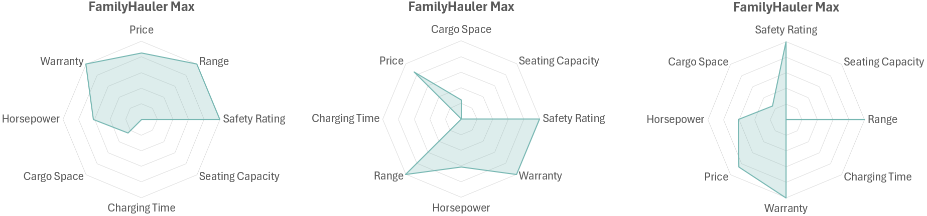
There are other issues with radar graphs, such as the fact that just changing the order of the categories (i.e., the “spokes” in the radar graph) can make the same item with the same attributes look completely different. The three radar graphs below, for example, all show the exact same car with the exact same attributes, just listed in a different order:
...but I'll leave it at that for now so that we can move on to the second common use of radar graphs, which are…
Radar graphs for showing cyclical time series data
… like this:

If you know how to read radar graphs and stare at this one long enough, you might notice the following insights:
The four weeks shown generally follow a similar pattern (peaked on Thursday, bottomed out on Saturday, etc.)
Each week was generally higher than the last.
The values for Fridays and Saturdays were similar for all weeks.
Now let’s look at the same data as an…
“Overlapping cycles” chart
…like this:
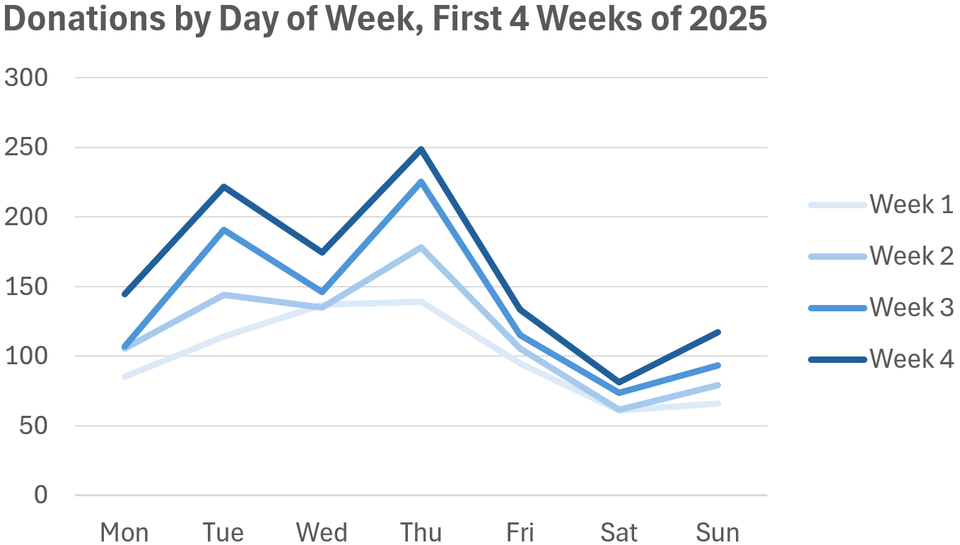
Again, to my eye, all the insights that I spotted in the radar graph are at least as clear in this (considerably more familiar) line chart. This chart actually seems more informative than the radar graph because I noticed a few things that weren’t as obvious in the radar graph, like the fact that Week 1 didn't have "Wednesday dip" like the other weeks.
Does this mean that you should never use radar graphs? No, there’s one (rare) situation in which I think a radar graph can be the best choice, which is…
When the values are associated with points on a circle
While quite rare in practice, there are situations in which the values are associated with points on a circle, for example, the directions from which wind can come:

Using a radar graph makes sense in this situation because the values in the chart are associated with the points on a circle (or, rather, an octagon in this case). Indeed, this type of "prevailing wind direction" chart is so widely used in maritime navigation and aviation that it has a name: a wind rose. Values like car features, the days of the week, etc., aren't associated with points on a circle, however, so showing them arranged in a circle is a perceptually dicey proposition, IMHO.
What now?
I should clarify that I’m not saying that radar graphs should be avoided solely because they're unfamiliar to many audiences (although that is the case), or that we should avoid asking audiences to learn to read new chart types. I recommend plenty of other chart types that many audiences aren’t familiar with, such as scatter plots, histograms, and step charts, but I recommend those chart types because there are situations in which more familiar chart types can’t communicate the same insights.
I avoid radar graphs because more informative and familiar chart types like heatmaps and overlapping cycle charts can always communicate the same insights as a radar graph, AFAIK. I have yet to come across a single insight that was clearer in a radar graph than it was in a simpler, more familiar chart type, so I'm not aware of any situations in which they’re the best choice (apart from the special "values are associated with points on a circle" case).
I know some people balk at the suggestion that any chart type should be avoided altogether, and insist that every chart type has situations in which it’s the best choice. I’m not sure why that would be true, however, for reasons that I discussed in this article.
Finally, there’s another reason why I avoid radar graphs that I haven’t mentioned yet, which is that I’ve seen a lot of people feel stupid because they struggled to read them or failed to grasp them entirely. Possibly the best reason to avoid radar graphs (or any needlessly complicated chart type), then, is to avoid making people feel dumb for no reason.
BTW, 🇳🇱 Netherlands friends 🇳🇱 ! I'll be delivering a live, in-person workshop in Amsterdam on Oct. 27-28 (Practical Charts) and Nov. 13-14 (Practical Dashboards). Info/registration page: https://fienta.com/nick-desbarats-amsterdam-2025 . 30% of the seats are already gone and the early-bird discount ends Sep. 29, so don't wait! Hope to see you there.