


Blackwells (paperbacks for European customers)
Bulk orders
(5+ copies)
Have more than 10K followers?
Contact us to request a complimentary reviewer copy.
Ready to become a true dataviz pro?
The Practical Charts Book
Amazon #1 New Release, 4.8-star rating (as at Apr. 8, 2026)
Based on the world-class course delivered to NASA, Visa, Bloomberg, Shopify, etc.
Used at Yale and other top universities
Get this book for free with the…

Practical Charts On Demand course
6.5 hours of video in 45 lessons
Get really good at creating really great charts, really fast.

Too often, your audiences don’t seem to “get” your charts or, at least, don’t seem to appreciate them. They might (or might not) understand how to read them, but they often ask questions like, “What’s the point of this chart? What am I supposed to get from this?” Sometimes, they even seem bored by your charts—or just skip reading them altogether—even though you’re pretty sure that those charts contain valuable insights.
There are a variety of reasons why many charts don’t get the reaction that the chart creator was expecting, but the most common reasons are disappointingly mundane: poor chart type choices, numerical scales that are too wide or too narrow, poor color choices, etc. While these chart design choices may seem simple, they’re surprisingly tricky to get right. Even major news media outlets, universities, government agencies, and high-tech companies routinely publish charts with poor design choices that cause those charts to flop with audiences.
Learning how to make expert-level chart design choices doesn’t have to be difficult.
The good news is that it doesn’t take long to learn how to make chart design choices that produce charts that are easy to read, compelling, and professional-looking.

Written in a friendly, jargon-free style by globally recognized educator and author Nick Desbarats based his experiences teaching data visualization to thousands of professionals at organizations such as NASA, Bloomberg, Yale, The United Nations, Visa and others, Practical Charts teaches chart creators of any experience level to create charts like an expert with years of chart-making experience, but in just a few days (or however long it takes you to read the book).
Quickly learn to make expert-level design choices…
Practical Charts provides concrete, highly specific guidelines for choosing from among 30 common chart types and for making all other major chart design and formatting choices (choosing colors, choosing scale ranges, etc.). Decision trees (such as the one on the right), rules of thumb, and over 180 key takeaways quickly guide chart creators to expert-level design choices, and don’t rely on experience or judgment that chart creators might not have acquired yet.
(Click image to enlarge)
Avoid dozens of common chart design mistakes…
Practical Charts also features dozens of common chart design mistakes that confuse readers or—worse—cause charts to unintentionally misrepresent the data (which happens surprisingly often). Examples of “corrected” charts in the book allow chart creators to quickly learn how to avoid these common design mistakes in their own charts.
{Click image to enlarge.)


Blackwells (paperbacks for European customers)
Bulk orders
(5+ copies)
Praise for the Practical Charts book and course
Amazon rating
(as at Apr. 8, 2026):

“…the best data visualization training that’s currently available…”

“Absolutely insightful, user-friendly, comprehensive, impactful, and engaging!”

“…a game-changer for anyone interested in data visualization.…”

“…amazingly approachable and understandable…”

“…a treasure of knowledge, presented in a conversational and engaging style…”

“…the decision trees…made chart selection so much easier!”

“10/10 recommend for anyone who has to create charts in their lives, data worker or not.”

“…truly eye-opening!”

Do you create charts for more data-savvy audiences?
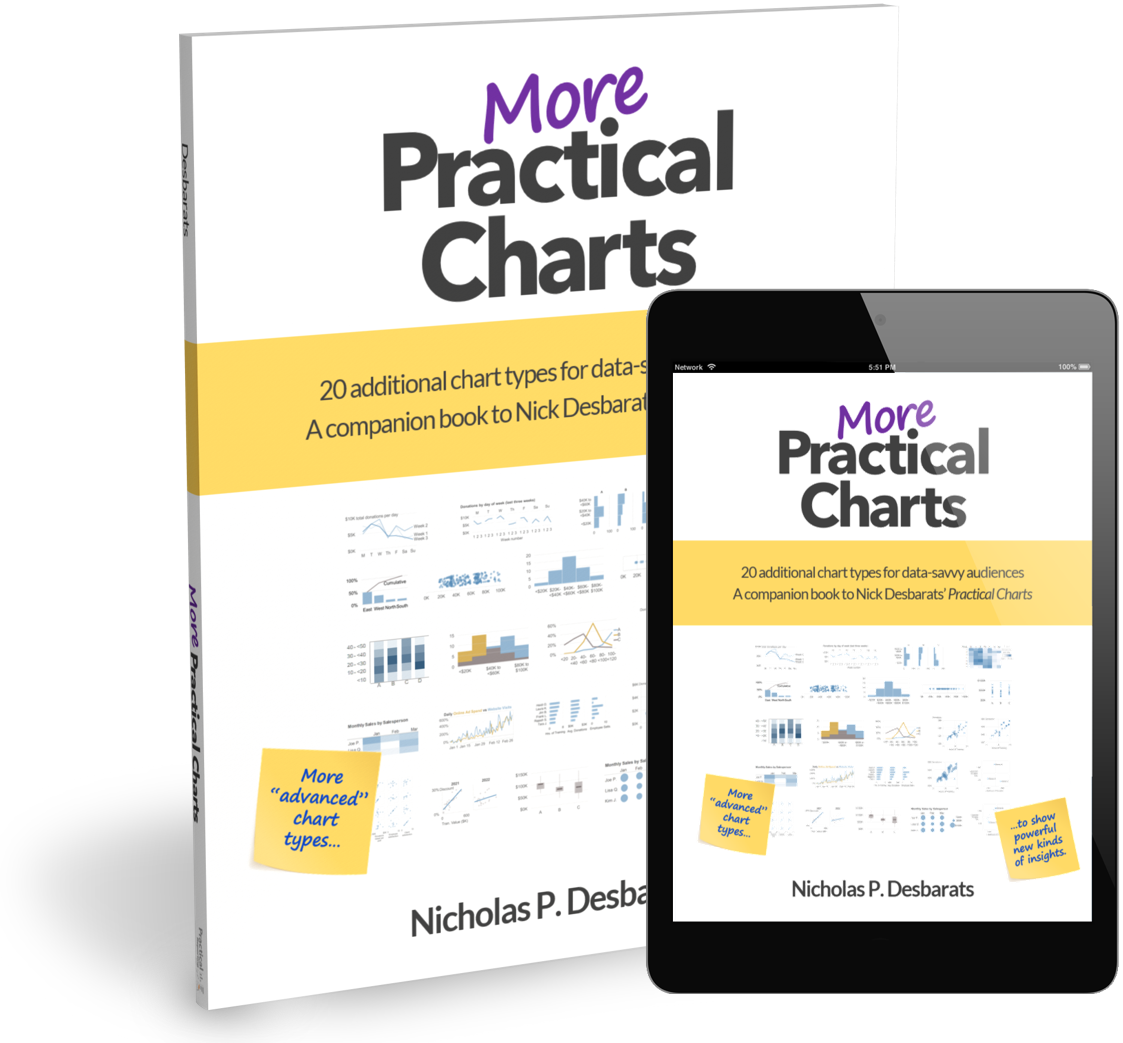
If you create charts for audiences with above-average levels of data savviness, consider also purchasing the optional companion book, More Practical Charts, which covers an additional 20 relatively “advanced” chart types, such as scatter plots, histograms and cycle charts.
Both books can be purchased individually from most major book retailers or our online store, or together as a discounted bundle in our online store.
-
Practical Charts is written for anyone who regularly creates graphs and tables for “everyday” reports and presentations. Target readers include business intelligence professionals, data analysts, data scientists, statisticians, and software developers, as well as educators, financial and policy analysts, marketers, human resource professionals, researchers, sales professionals, journalists and any other role that requires communicating data to others.
The book is suitable for those with little data visualization experience, but those with decades of data wrangling experience will also benefit since many have never learned how to design effective charts. Readers don’t need to have any prior data visualization knowledge, however, they should have at least some experience creating basic charts in a data visualization software product, such as Microsoft Excel, Tableau Desktop, Google Sheets, Qlik Sense, JMP, or a similar tool.
-
While many excellent books on data visualization have been written during the past 100+ years, Practical Charts…
Provides guidance that’s more specific, not relying on intuition or experience that chart creators might not have acquired yet.
Is more complete, covering many common design challenges (e.g., how to handle outliers, how to handle missing values, when to include or not include zero in a chart’s scale, etc.) and common mistakes that come up all the time in practice, and that tend not to be covered in other books.
Is friendlier, written in simple, jargon-free language that’s easy to read for data visualization novices and those for whom English is a second language. There are even some jokes. Or things that I consider to be jokes, anyway. Whatev.
-
Practical Charts is organized into seven parts:
Part 1: General chart formatting guidelines
Part 1 covers formatting guidelines that apply to all chart types, as well has how to avoid common chart formatting mistakes:
Formatting gridlines, tick marks, axis lines, borders, and other “non-data” elements
Formatting scales (categorical, quantitative, time)
Choosing colors
Formatting legends/keys
Formatting text, numbers, and dates
Part 2: Choosing a chart type
Part 2 is the longest part of the book, containing detailed information on 30 important chart types that are commonly needed when making everyday charts and when to use each, organized into seven groups:
Line charts and other ways to show data over time
Pie charts and other ways to show the breakdown of a total
Maps
Bar charts
Tables
Combo charts
Chart types to use cautiously or avoid
Part 3: Showing data with a more complex structure (“small multiples”)
Part 3 discusses how to handle common, challenging situations when the data to be visualized has a more complex structure.
Part 4: Interactive filters and chart animations
Part 4 discusses the unobvious but significant challenges that interactive filters and animation can create for audiences and provides suggestions for how to avoid using these features.
Part 5: Making charts obvious
Part 5 covers techniques for making key messages and takeaways obvious, such as visually highlighting the most important part(s) of a chart, explicitly stating insights and recommendations in chart callouts and titles, and adding comparison/reference values.
Part 6: Making charts less boring
Part 6 summarizes techniques from other chapters that make charts interesting and engaging, and includes a list of other ways that chart creators often try to “spice up” charts but that end up making charts harder to read, less obvious, or more prone to misinterpretation.
Part 7: What now?
Part 7 provides suggestions on how to continue learning and improving, as well as my take on some emerging technologies that might (or might not) change data visualization in the future.
-
How to use specific software products (Excel, Tableau, Qlik, etc.)
The guidelines in Practical Charts apply to all “everyday” charts, regardless of the software product that’s used to create the chart. It assumes that you have a basic (not expert) working knowledge of at least one data visualization software product and access to an Internet search engine to look up anything that you’re not sure how to do in that software product. None of the chart types or techniques in the book require specialized software product features or expertise.
How to create artistic charts, data art, infographics, etc.
Everyday charts for reports and presentations generally don’t need to be artistic (although they shouldn’t be ugly; more on that in the book).
How to create specialized charts
Practical Charts only covers simple, everyday charts for reports and presentations. There’s no discussion of specialized charts for fields like mineral exploration, advanced financial analysis, genomics, etc. However, most of what this book teaches will apply to those more specialized charts, as well.
How to design information dashboards
Information dashboards entail a whole other set of challenges that don’t arise when creating individual charts. For information on creating effective dashboards, check out the Practical Dashboards course.
Advanced “data storytelling” techniques
This book focuses on what Nick calls the “spelling and vocabulary” of dataviz, which includes fundamental skills such as choosing a chart type, deciding how wide or narrow to make quantitative scales, and many others. It’s necessary to learn these fundamental skills before learning how to create effective “data stories,” since making a poor chart type choice or making a scale too wide or narrow will (and frequently does) torpedo even the most effective data stories.
The book covers some basic “storytelling” techniques, such as adding key takeaways in callouts in charts, but not advanced storytelling techniques, such as using suspense, characters, or story arcs.
Using charts for data analysis rather than communicating data to an audience
While charts are obviously an effective way of communicating data-related insights to others, they’re also a powerful way to explore and analyze data on your own. Using charts to explore and analyze data on your own is fundamentally different from using charts to communicate insights to an audience, however. This book only covers creating charts for communicating data to others.
Therefore, the book only covers chart types that most audiences are familiar with, such as bar charts, stacked bar charts, clustered bar charts, line charts, pie charts, etc., along with a few less common chart types that are required to communicate data accurately in specific but common situations, such as step charts, dot plots and merged bar charts. If your audience is relatively sophisticated and can grasp “advanced” chart types such as scatter plots, histograms and cycle plots, my book, More Practical Charts: 20 additional chart types for data-savvy audiences covers those chart types and is scheduled to be published in 2024.
This book also doesn’t cover how to decide which insights you should communicate to an audience, which questions you should answer for them, etc. Those skills go far beyond data visualization and fall under general business skills, performance management, strategic planning, and other areas. This book “begins” when you have some data and something to say about that data, and covers how to do that effectively.
-
The Practical Charts and More Practical Charts books are based on Nick Desbarats’ Practical Charts course. The Practical Charts course is available as a pre-recorded, on-demand course, and Nick regularly delivers live, private workshops for 15 to 60 employees of the same organization, and live open-registration workshops approximately three times a year. For more information on taking the Practical Charts course, please click the links above or contact us.
-
Interested in purchasing 10 or more copies of Practical Charts for your team or organization? We offer discounts on bulk purchases.
For information on booking Nick to deliver a private Practical Charts online or in-person workshop for your team, please contact us.
-
“Practical Charts is essential material for any class on data, charts, and graphs.”
- Simon Queenborough, Senior Researcher and Lecturer, Yale UniversityContact us to request a complementary desk copy and for information about educational discounts.
-
Missing pages? Poor color quality? Other weird problems? Unfortunately, you may have a counterfeit (fake) copy of Practical Charts (argh). How to verify if your copy is genuine.