My crazy crusade against single-number KPI targets


tl;dr: Almost all organizations set single-number targets for their KPIs (e.g., a sales target of $5M for next quarter), however, this approach causes some surprisingly serious problems, all of which are solved by using four numbers to communicate expectations regarding a KPI’s performance, rather than just one.

When I teach my Practical Dashboards course, I recommend against setting single-number targets for KPIs.

I know.

WTF.

Almost every organization does this, and they’ve probably been doing it since the dawn of the Industrial Revolution.

I get it, but setting single-number KPI targets causes some surprisingly serious problems that, I think, are obvious when they’re pointed out, and I think a better approach exists.

What, exactly, is wrong with single-number KPI targets?

Scenario time…

At the beginning of this quarter, our company’s CEO set a sales target of $5M for the quarter, but we ended up just missing it and we only hit $4.96M. So, how should we feel about $4.96M? It seems kind of silly to feel that we “failed” when, from the company’s perspective, $4.96M is virtually the same as $5M.

We could instead just say that, for all intents and purposes, we hit the target, but what if we’d hit $4.9M instead of $4.96M? Should we still consider that we “hit the target, for all intents and purposes” at that point? What about $4.8M? $4.5M?

Basically, at what point do we start to consider sales to be a problem that we need to take action on? With a single-value target like $5M, this is left up to the reader to decide, and they may or (much more often) may not have enough background knowledge to determine that.

Worse yet, different readers will have different takes. Some will say that $4.8M is still fine, whereas others will say that $4.8M would be a huge problem that needs to be solved.

And what if we exceeded the target and hit $5.2M? Would that still be "fine," or would it be absolutely amazing? Hmmm…

What's going on?

I think the underlying issue here is that the CEO expressed her expectations of what sales revenue should be as a single number (i.e., $5M), but that’s not how she—or anyone else—actually thinks about sales.

To find out how the CEO actually thinks about sales, we could show her a series of theoretical sales values to react to such as, say, $4.5M, $4.6M, $4.7M […] $5.4M, $5.5M, and ask her what she’d think if sales were at each of those levels. If we ran this exercise, she might tell us something like this:

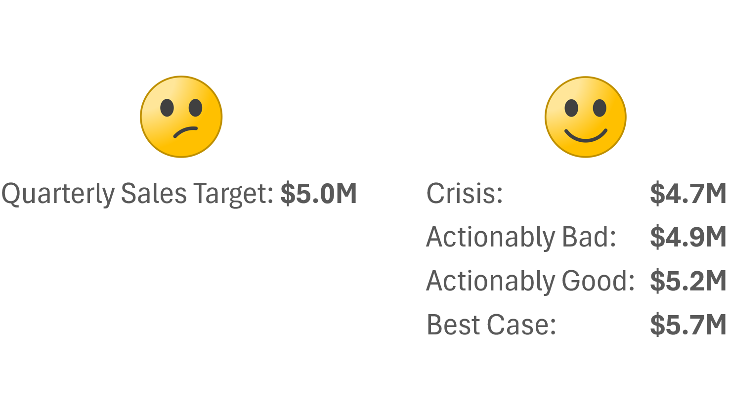
  • If sales were below $4.7M, that would be a disaster. We’d have to lay people off.

  • If sales were at or above $4.9M, that would be fine.

  • If sales were above $5.2M, that would be more than just fine. We’d probably hire a few more employees at that point.

  • If sales were above $5.7M, that would be amazing. I doubt we’d ever hit that but, if we did, I’d adjust my expectations upward for future quarters.

Expressing the sales target as a single number like “$5M” doesn’t capture any of this crucial information.

“But,” I hear you collectively say, “we could report the percentage that we’re above or below each KPI’s target instead, and define, say, 5% below target as a problem, and 10% below target as a major problem.”

Sounds good in theory; doesn’t work so great in practice. Why not? The gotcha with this approach is that the same thresholds (e.g., “5% below target is a problem and 10% below target is a major problem”) can’t be applied across all KPIs because being, say, 5% below target would be a catastrophe for some metrics (e.g., “Website Uptime”) and a total nothing burger for others (e.g., “Cash On Hand”).

Therefore, reporting that a given metric is "x% below target" doesn’t actually tell the audience much. Depending on the metric, that could be fine, or it could be a disaster, and it’s entirely up to the audience to figure that out.

Is there another way to set targets that doesn’t have all these downsides? I’m glad I assumed that you asked…

Set four numbers for each KPI

In my Practical Dashboards course, I recommend expressing expectations for the performance of a KPI as four numbers, rather than just one. Each of these four numbers has a very specific definition:

  1. Crisis: The level at which we’d pretty much drop everything until this KPI improved.

  2. Actionably bad: The level at which we wouldn’t just be concerned, we’d be so concerned that we’d do something (e.g., cancel bonuses, launch an investigation, etc.)

  3. Actionably good: The level at which we wouldn’t just be pleased, we’d be so pleased that we’d do something (increase bonuses, make new investments, etc.)

  4. Best case: The best we’d realistically be able to achieve for this KPI. We’d probably never hit this number but, if we ever did, that would be extraordinary.

Using these four numbers, we could represent the CEO’s thoughts about sales revenue accurately, like this:


This tells everyone exactly what any given sales number would mean to the CEO and, more importantly, what to do (or not do) in response to that number. For example, everyone can see that, if sales are between $4.9M and $5.2M, that would be fine and we wouldn’t need to take any action.

If we only had a single-number target like $5M, however, what would sales of $4.95M mean? Should we panic? Or do nothing? What about $4.8M? Everyone's guessing at that point.

If this four-number approach is used to color-code what I call “action dots” on a dashboard, we end up with something that’s far more useful since the reality is that most metrics fall in the "no action required" range (between Actionably Bad and Actionably Good) most of the time, so only metrics that actually require us to do something get flagged:

As opposed to a dashboard that shows "% deviation from target," which flags all metrics all the time, regardless of if they actually require action or not:

What now?

Do I expect everyone to ditch single-number targets and start setting four-number ones after reading this post? Probably not. Inertia is a powerful thing…

Many of my clients have started doing it, however, and are reaping the benefits. So, if you find that the four-number approach has merit, it might be worth trying to move this particular mountain in your organization…

BTW, I cover this and many other topics in my Practical Dashboards course, which I'll be delivering in two in-person workshops in Europe this fall!

  • I'll be delivering an "abridged," one-day version of Practical Dashboards as part of SmashingConf in Freiburg, Germany on Sept. 8, 2025. Here's the workshop info/registration page.

  • I'll be delivering Practical Charts and the full two-day Practical Dashboards course in November 2025 in London, U.K. in partnership with Rupe Ltd. Register your interest by completing this short form before July 31st to get 20% off the registration fee and be notified when tickets go on sale.

Hope to see you at either event (or maybe both if you're a super-keener 😂).

How to show OUTLIERS in charts (and how not to)


Have you ever tried to visualize a set of values only to find that an outlier in the data (i.e., a value that's much larger than the other values) was messing up the chart by making the other values too small to see clearly?


Now, it's important to note that this chart may or may not be problematic. For example, if the "job" of this chart is to show that Russia is much larger than other European countries, this chart does that job perfectly and doesn't need to be "fixed." If, however, the job of this chart is to say something about how the smaller values compare with one another, then, obviously, this chart wouldn't cut it.

Chart creators typically use one of four methods to deal with outliers, one of which I think is the most effective by far.

BTW, if you want a lot (like, a lot a lot) more tips like these, I'll be delivering my Practical Charts course live online, beginning on June 2nd, 2025! Info/registration: https://www.practicalreporting.com/june-2025-online-workshop Hope to see you (online) there!

The first method is to simply exclude the outlier(s) from the chart, but this isn't ideal:


The second method is to "break" the quantitative scale, but this isn't a great solution either:


The third method is to switch to a logarithmic quantitative scale but, again, this isn't ideal:


Most audiences struggle to read values on logarithmic scales accurately (assuming they know how to read them at all). Logarithmic scales can be useful for certain types of analysis, but generally not for “everyday” charts.

The fourth method, and the one I use myself in virtually all situations, is to use an inset chart:


When designing inset charts, subtle design details help readers understand how the “zoomed-in” chart relates to “big-picture” chart:


Note that inset charts aren't limited to bar charts, and can be used to handle outliers in almost any chart type:


If you're designing charts that will be dynamically generated in a live dashboard/reporting application (Power BI, Tableau, etc.), unfortunately, these applications generally don’t support subtle design details like those shown above. Inset charts can still be used, but the relationship between the two charts will be less visually obvious without the boxes, drop shadows, etc.:


As I mentioned earlier, if you want more tips like these and to become a true dataviz pro, I'll be delivering my Practical Charts course live online, beginning on June 2nd! Info/registration: https://www.practicalreporting.com/june-2025-online-workshop Hope to see you (online) there!

"Economic Chaos" Sale! 25% off courses and books until May 20th!


I get it. With the unpredictability that's been injected into the global economy, many of us are hesitant to make any kind of new investments, including new upskilling investments.

That's why I've decided to make it easier to take my courses and get my books by discounting prices by 25% for seven days, from now until May 20th:

My courses and books don't go on sale often, so take advantage of it!


New video! Should you be using AI to create charts instead of Excel/Tableau/etc.?


Generative AIs like ​ChatGPT​, ​Claude​, and ​Gemini​ have been steadily improving their chart-making abilities during the past year or so and now claim to be top-notch chart creation tools. Is this just AI hype, or is it time to switch from Excel/Tableau/etc.?

❓ Is it faster and/or easier to create charts in AI?

❓ Can AI handle the kinds of charts that you need to create? How good are the results?

❓ How much human help does AI need? Can it produce well-designed charts without human intervention?

❓ Are AI-generated charts reliable and accurate?

Having recently put various AIs through their chart-making paces, I can say that the answer to all of these questions is a resounding “it depends.” Sometimes it makes sense to use AI (although there are important caveats to be aware of). Sometimes, however, a tool like Excel or Tableau will be the better choice. When should you use which tool? What are the caveats around using AI? Find out in my latest video (see links below).

One thing that became clear in my testing was that, if you want top-notch charts, you still need top-notch dataviz skillz—even if you're using AI. How can you acquire those skills quickly? Well one pretty good way would be to take my Practical Charts course​, which I’ll be delivering in a live online public workshop in June! Info/registration: ​https://www.practicalreporting.com/june-2025-online-workshop​

Watch the "Should you use AI to create charts?" video on...

Why it wouldn’t make sense to adapt Practical Charts to Power BI’s limited visuals

My Practical Charts course is tool agnostic, that is, it doesn’t assume that any particular dataviz software product (Excel, Tableau, Google Sheets, etc.) is being used. There are three reasons for this:

  1. The guidelines for making design choices like choosing a chart type or choosing a color palette are the same, regardless of which dataviz software product is being used.

  2. All the chart types and techniques in Practical Charts are pretty standard and can be implemented in just about any modern dataviz software product.

  3. If a workshop participant is unsure of how to create anything that I show in the course, high-quality tutorials for just about every major dataviz software product are just a Google search or AI prompt away.

You might have noticed that, in those last two reasons, I referred to just about any major data visualization software product. The “just about” qualifier is there because of one unfortunate exception:

Power BI.

In this post I explain why I don’t think it makes sense to change my Practical Charts course due to Power BI’s limitations.

Read more

No, everyone DOESN’T know how to read a scatterplot

When I’m chatting with other chart creators, it sometimes feels like there are two different groups that live in two completely different worlds:

The first world is populated by those who create charts for relatively data-savvy audiences. In this world, chart types like scatterplots and histograms are “basic” chart types that everyone knows how to read.

The second world is populated by those who regularly create charts for “non-data” audiences who often struggle with anything other than simple bar, line, or pie charts.

Read more

Should you avoid using “advanced” chart types? (+ Black Friday Sale!)

I’ve seen the following scenario play out many times in the organizations with which I work:

A chart creator decides to “get creative” by using a histogram, connected scatterplot, ribbon chart or some other chart type that they know to be unfamiliar to the audience. They could have used a simpler, more familiar chart type to say the same things about the data, but they wanted to “challenge the audience,” or “teach them new chart-reading skills.”

The chart then goes over like a lead balloon, however. The audience misreads the chart, skips reading it altogether, or gets annoyed with the chart creator, who then feels bitter, believing their audience to be intellectually lazy or just dumb.

Read more

“I don’t want red on my dashboards. It looks too negative.”

I first heard this objection from a client a number of years ago and it took me so off-guard that I just stared at them and then mumbled something about getting back to them on that. It just seemed like such a bizarre thing to say…

Since that time, I’ve heard this objection at least half a dozen times and have had a chance to formulate a couple of responses that usually convince dashboard users to rethink their “no red” policy.

Read more

Dashboards should only show the “most important” metrics… right?

I regularly hear complaints from dashboard creators that go something like this:

  • "My users consider dozens of metrics (or more) to be ‘KPIs’ and they want me to put them all on the dashboard."

  • "My users don’t understand that, among all the metrics that we could show on the dashboard, only three to five of them are truly important. The rest are just noise that distract from the truly important numbers, and so don’t belong on the dashboard."

Think about that for a second, though. Does it seem plausible that someone could run an entire team, department, or organization based on just five numbers?

Read more